
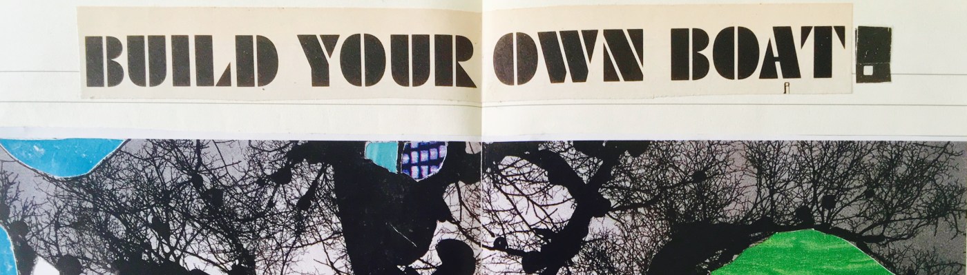
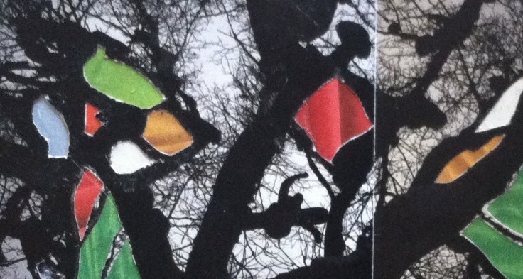
This cut-up poem is very hard to look at. The colors are just atrocious: almost all the hues are exactly the same value and saturation. This is such a huge no-no in design ( I should know: I attended a lot of art colleges and took Color Theory 101 at each one).

But, honestly, the intensity is what I love about this and what drew me to the font in the first place. Continue reading “The Eye is the First Circle”


You must be logged in to post a comment.